Options (Tools menu)
Modifies the Form Designer settings that control the appearance and behavior of the program. For convenience,
the options are presented on separate panels. The panels are changed by the selecting the appropriate
category in the options tree on the left side of the dialog.
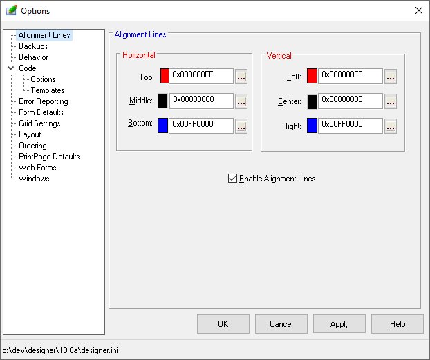
Alignment Lines
Alignment Lines aid in the the placement and sizing of controls on a form. When enabled, lines will appear
during sizing and movement operations to indicate relationships with other controls having the same parent
on the form.
The Alignment Lines option window allows customization of the line colors and enabling of this Designer
feature. A toolbar button also controls this feature.
Backups
The Designer's backup system allows the archiving of forms and printpages as they are maintained.
When a form is saved, the original version is stored in backup directory and the modified form is then
saved as specified by the user. The archiving of forms in the backup directory is done by appending a
suffix of ".bknn" to the file name. The "nn" is a number from one (1) to the value
of the number of backups to keep option. The backup files are stored with the lowest number being the
most current.
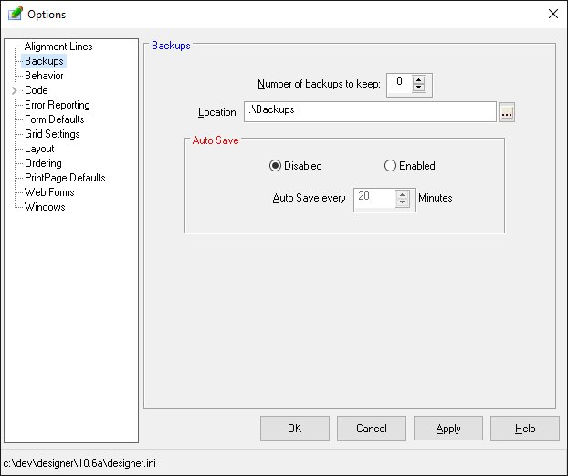
An auto-save option allows the archiving of files automatically at specific time intervals. The auto-save
process is the same as used during a save operation.
-
Number of backups to keep
-
This option controls the count of the backup files kept for each form modified by the Designer.
-
Location
-
This option defines the location for the backup files. If no location is specified, the backup files
are stored in the current working directory.
-
Auto Save Enabled/Disabled
-
These options control the execution of the auto save feature.
-
Auto save every nn minutes
-
This option controls the frequency of the auto save function when enabled.
-
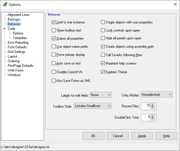
Behavior
Options on the Behavior panel control various functions of the Designer.
-
Limit to one instance
-
This option prevents multiple copies of the form Designer from executing at the same time. Attempting
to invoke the Designer when already active will result in the existing Designer coming to the foreground.
-
Show toolbox text
-
This option allows the tool description to be displayed in the Toolbox.
-
Output all properties
-
This option controls the properties output during an Export to PLS operation. Normally, the Designer
will only output properties that are not set to the default system value. By selecting this option, all
property settings are output.
-
Use object name prefix
-
This option instructs the Designer to prepend the form's prefix property value to the object's default
name when the object is created.
-
Force primary display
-
When this option is checked, the Designer will ensure that its windows (toolbox, properties, outline,
etc) are visible within the current bounds of the screen. This option is useful when developing forms
in different screen resolutions.
-
Auto save on test
-
This option instructs the Designer to automatically save a form before executing a test (Tools/Test Form)
function.
-
Disable Comctl V6 Properties
-
This option instructs the Designer to not allow the use of any ComCtl V6 properties.
-
Also Save Forms as XML
-
This option instructs the Designer always create an XML version of the form when saving in non-XML format.
XML forms allow using of text comparison utilities.
-
Create objects with user properties
-
This option specifies that any user-defined properties for an object type should be applied when an object
of that type is created.
-
Lock controls on open
-
This option sets the Lock Controls option as each form is opened. This action prevents accidental changes
to a form by mouse operations. The form may be unlocked using the Lock Controls selection of the Format
menu or by clicking the Lock Controls toolbar button.
-
Hide all panels on open
-
This option instructs the Designer to hide all panels and tabpanels when the form is first opened. Normally,
the Designer will restore the panel's visibility to its state when the form was saved.
-
Create objects using assembly path
-
This option instructs the Designer to store the assembly path for any netcontrols or netobjects used.
Normally, no path information is stored and the runtime will initiate a standard search for assemblies
when the form is used in a program.
-
Generate tabpanel change code
-
This option controls whether the Designer will generate its own code for the Change event of any TabControls
that have TabPanels defined. When set and user code exists for the change event, a warning is displayed
before the code is overwritten.
-
Call SaveAs following New
-
This option commands the Designer to immediate call the SaveAs file menu function when a new form is created.
This allows the user to specify the form name and location when the form is created.
-
Maximize help screens
-
This option instructs the Designer to maximize any help screens displayed.
-
Explorer Theme
-
This option instructs the Designer to apply the Explorer theme to any Designer windows. The Explorer
them alters to appearance of some objects such as treeviews and listviews.
-
Labels for edit fields
-
This option instructs the Designer to create labels for all new edittext, editnumber, and editdatetime
objects. The user may select the position of the label as to the left, right, above, or below the edit
object.
-
Toolbox Style
-
This option allows the user to select the preferred toolbox style..
-
Color value display
-
This option controls the format of numeric color values. Options are decimal, hexadecimal, or three byte.
-
Recent files
-
This option defines the number of files allowed in the Recent Files list of the File menu.
-
Double Click Time
-
Allows adjust of the time period between mouse click that signifies a double click..
-
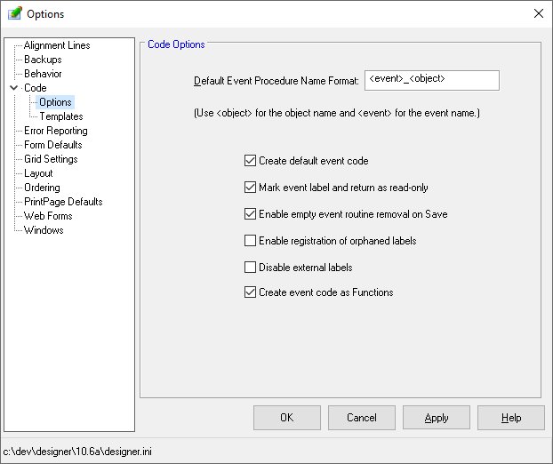
Code Options
Options on the Code panel control the Designer's defaults for event procedure naming and code generation.
This category has two sub-categories - Name and Template.
-
Default Event Procedure Name Format
-
This option allows definition of a mask for event procedures created by the Designer. A default event
procedure name should contain a reference to the object and to the event. Within the format string, the
Designer will replace "<object>" with the name of the object and "<event>"
with the event name. A typical format string is "<event>_<object>".
-
Create default event code
-
This option controls the automatic creation of event code when an object in the design window is double-clicked.
Disabling this feature will result in the code window being opened but no event selected and no code generated.
Upon selecting an event, the Code Template is applied and an event procedure generated.
-
Enable registration of orphaned labels
-
This option allows the Designer to register event labels found in the event code that is not currently
registered.
-
Mark Event Label and Return as Read-Only
-
This option instructs the Designer to flag event label and return lines as read-only in the source editor.
When this option is not set, it is possible to edit the label and return statements. Such modification
can easily break the linkage between the object and its code.
-
Disable external labels
-
This option instructs the Designer to not allow the use of external labels for event routines.
-
Create event code as Functions
-
This option instructs the Designer use the Function template when creating event routines.
-
-
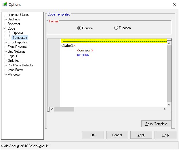
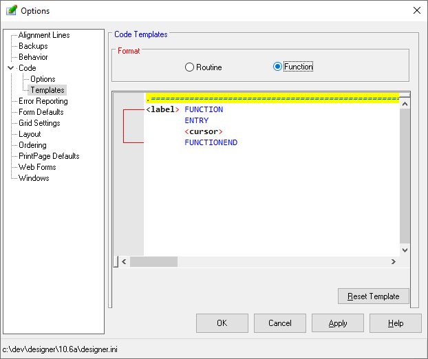
Code Templates
-
-
This option allows definition of a standard template used when generating an event procedure or function.
Four key words are allowed in the template and each may be used any number of times. The "<object>"
tag will be replaced by the object name. The event name is substituted for the "<event>"
tag. The "<label>" tag will substitute the default event procedure name. Note that this
name is configurable using the previous option. Finally, the "<cursor>" tag designates
where the cursor should be positioned up initial entry.
-
-
-
-
-
Reset Template
-
This option instructs the Designer restore the select template type to its default definition..
-
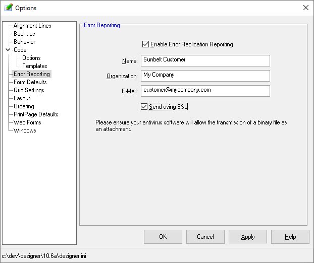
Error Reporting
Options on the Error Reporting panel control the Designer's action in the event of an internal error.
The Designer has the ability to produce and mail a problem replication package to Sunbelt support. The
package contains the current Designer information (ini) file, the forms active when the error occurred,
and the user actions applied to the form since it was opened. Once received by Sunbelt, the actions are
played back to the point of failure and the error analyzed.
The sending of the mail message does not require access to the user's mail system. No mail configuration
parameters are required.
-
Enable error replication reporting
-
This option controls the reporting of errors. When disabled, the user will see an error dialog if a Designer
failure occurs but no report will be sent to Sunbelt.
-
Name, Organization, Email
-
These optional values are supplied to the mail system to identify the sending party.
-
Send using SSL
-
This option enables transmission of the email using the Secure Sockets Layer.
-
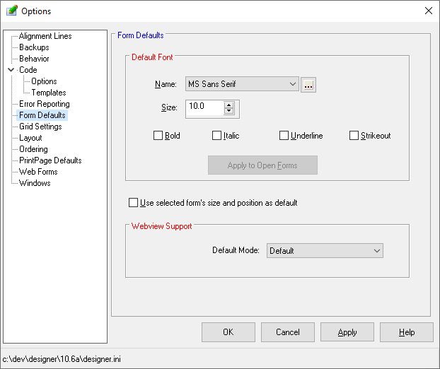
Form Defaults
Options on the Form Defaults panel control the Designer's action when new forms are created. The default
font may be defined. Note that a form's font values controls the font on any new object created on the
form.
-
Default Font
-
Allows selection of the default font for an new forms created.
-
Apply to Open Forms
-
Clicking this button will apply the specified font, size, and attributes to all open forms and all objects
on those forms.
-
Use selected form's size and position as the default
-
Instructs the Designer to note the current form's size and position. Subsequent forms created will then
default to these values.
-
Default Mode
-
Defines the default value for a new form's WebMode property.
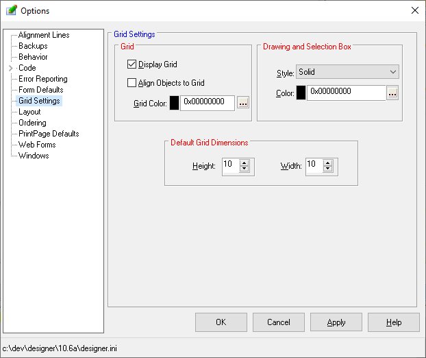
Grid Settings
The Grid Settings panel allows modification of the appearance and behavior of the Designer when
maintaining forms.
-
Display Grid
-
Controls whether the grid is visible during form maintenance.
-
Align Objects to Grid
-
Instructs the Designer to align objects created, moved, or sized according to the grid positions defined
by the grid height and width options. When checked, objects are moved or sized by a grid unit as defined
in form's Grid Horizontal and Grid Vertical properties rather than by a value of one.
-
Grid Color
-
Allows the user to select a color for the grid dots.
-
Drawing and Selection Box Style and Color
-
Allows the user to control the border style and color of the box used when drawing objects on the form
or when doing multiple selection using the "lasso" method.
-
Default Grid Height
-
Defines the vertical spacing of the grid in pixels for new forms. To alter the grid for existing forms,
use the Grid Vert property of the form.
-
Default Grid Width
-
Defines the horizontal spacing of the grid in pixels. To alter the grid for existing forms, use the Grid
Horz property of the form.
-
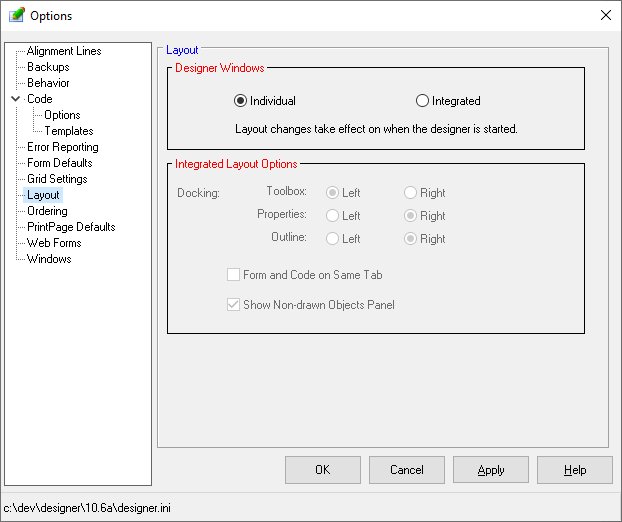
Layout
The Layou panel allows the Designer to execute using multiple windows or a single integrated window.
When a single integrated window is selected, it may be dock on the left or the right of the main window.
When the layout is changed, the Designer must be restarted before it becomes effective.
-
Designer Windows
-
Controls whether the Designer executes using individual windows or as a single integrated window. The
layout takes effect when the Designer is started.
-
Integrated Layout Docking
-
Instructs the Designer to dock the tab dialog containing the toolbox, properties, and outline window on
the left or right side of the Designer's screen. Options also allow control of the visibility of the
non-drawn objects panel and the ability to combine the design form and code editor on the same tab.
-
Form and Code on Same Tab
-
Allows the Designer to place both the form design panel and the event code panel on one tab rather than
each having their own tab.
-
Show Non-drawn Objects Panel
-
Controls the visiblity of the panel containing non-drawn objects such as timers and imagelists.
-
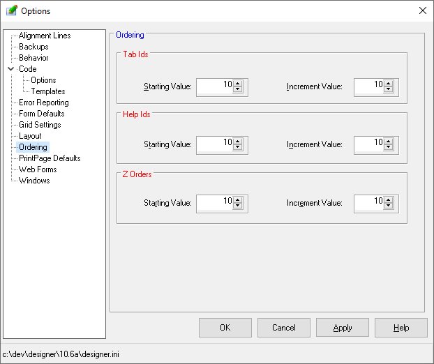
Ordering
The options on the Ordering panel control the assignment of tab ids, help ids and zorder values. Tab
ids are assigned as objects are created and may be reassigned using the tab id numbering function (Tools/Start
TabID Numbering). Help and ZOrder values are assigned as objects are created and may be modified using
the respective numbering from the Tools menu.
-
Starting Value
-
Defines the tab id, help id, or zorder value assigned to the first object selected.
-
Increment Value
-
Defines the value added to each successive object.
-
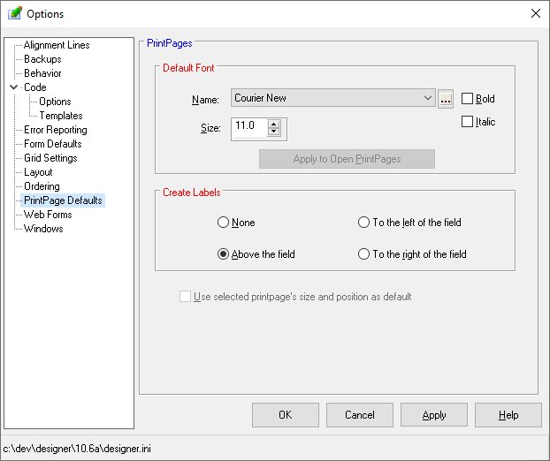
PrintPages
The options on the PrintPages panel control the behavior and appearance of the Designer when maintaining
a printpage.
-
Default Font
-
Allows selection of the default font applied to an new printpage created.
-
Create Labels
-
The form Designer can automatically create labels for each field placed on the printpage. This option
controls the creation and placement of the labels. Values are:
-
-
None - No labels are created
-
-
Above the field - A label is created and placed directly above the location of the data field.
-
-
To the left of the field - A label is created and placed on the report to the left of the data field.
-
-
To the right of the field - A label is created and placed on the report to the right of the data field.
-
-
Use selected printpage's size and position as default
-
Instructs the Designer to note the current printpage's size and position. Subsequent printpages created
will then default to these values.
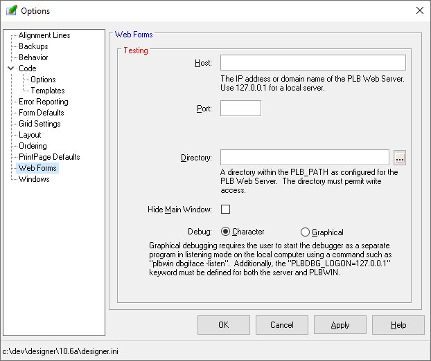
Web Forms
The options of the Web Forms panel control the testing parameters for WebView forms.
-
Host
-
Defines the IP address or URL of the host server.
-
Port
-
Specifies the port number on the Host machine to which a connection is made.
-
Directory
-
Defines the directory on the host that contains the object file.
-
Hide Main Window
-
Allows the Main Window to be hidden during testing.
-
Debug
-
Allows selected between character based for graphical debugging.
-
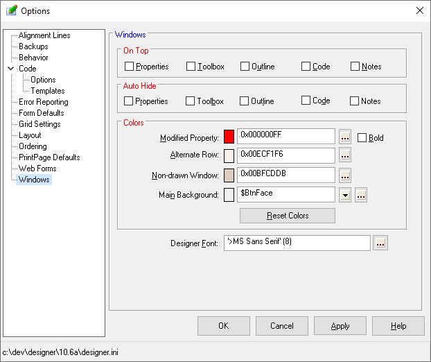
Windows
The options of the Windows panel control the position of the Designer windows and colors used by
the Designer.
-
On Top
-
Allows the specified windows to remain visible when occupying a screen position of another window.
-
Auto Hide
-
Allows the specified windows close when focus is moved to another window.
-
Modified Property Color and Bold
-
Allows configuration of the color used by the Designer to highlight properties that have values other
than the default. To disable this feature, simply choose a color of black.
-
Non-drawn Window
-
Allows configuration of the non-drawn objects window displayed at the bottom of the Designer when using
the integrated layout.
-
Alternate Row Color
-
Allows configuration of the alternate row color of the used throughout the Designer.
-
Main Background Color
-
Allows configuration of the background color of the Designer's main window.
-
Reset Colors
-
Restores the various colors to their original values.
-
Designer Font
-
Allows selected of the font used by the Designer.
-


